Role
Brand Designer
Collaboration
FLORNCE founder, Tay Williams
Deliverables
Logo, Visual Identity
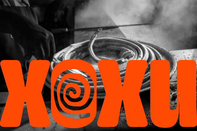
XOXU is a Mexican hot chocolate and churro cafe, inspired by the Mexican culinary culture and tradition.
Mexican hot chocolate and churros are deeply embedded in Mexican culinary culture, serving as iconic symbols of comfort, indulgence, and tradition. The rich, velvety texture of Mexican hot chocolate, often infused with spices like cinnamon and sometimes even chili, perfectly complements the crispy, doughy goodness of freshly fried churros. This beloved pairing is not just a treat for the taste buds but also a cherished social tradition, bringing friends and family together to savor the warmth and sweetness that these delicious treats offer. Whether enjoyed as a morning pick-me-up or an evening indulgence, Mexican hot chocolate and churros encapsulate the essence of Mexican culinary heritage and the joy of shared moments.
The XOXU visual identity is an ongoing project that has not been fully released yet. But the logomark is a nod to the overall creative approach that resonates with care, comfort, indulgence and warmth in the heavy, weighty structure of the typography, and the rounded edges. Sharp moments in the "X" interrupt the rounded, plump theme, symbolizing the spicy kick Mexican hot chocolate is known to offer through notes of cinnamon and chili.


More coming soon :)


